Charles River Labs | Data Visualization, Scientific Software
Reducing anomaly detection from 20+ minutes to under 3 minutes at Charles River Labs
~90% faster data analysis • 14K+ data points • Millions in operational efficiency savings
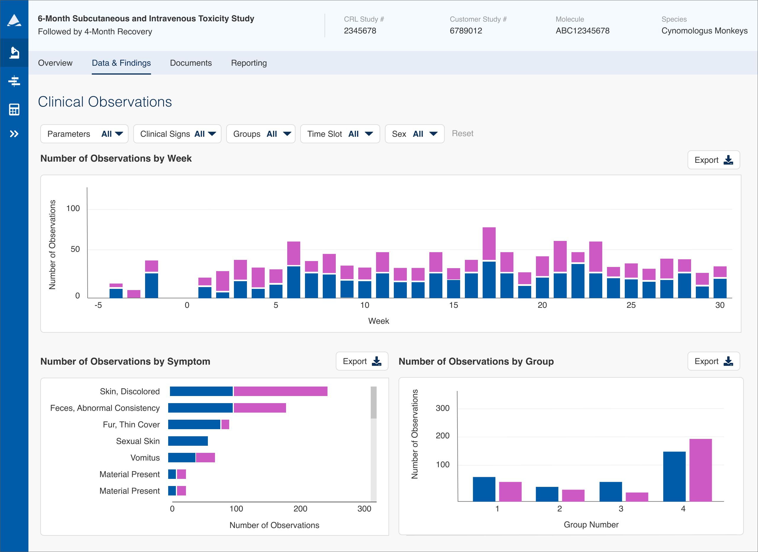
Overview: Making complex study data immediately actionable
The Safety Assessment module of Charles River's Apollo platform enabled scientists to analyze study data in near real time, but the interface required manually scanning large tables to identify anomalies.
I redesigned the experience to visualize complex datasets, allowing users to quickly identify patterns and outliers.
This reduced anomaly detection time from 20–30 minutes to just 2–3 minutes. The improvements also contributed to millions in operational efficiency savings by reducing time spent reviewing large study datasets.
Problem: Manual scanning made anomalies hard to find
To understand how users worked with this data, I conducted early research sessions with both study monitors (client-side scientists working on a drug) and study directors (internal CRL personnel who ran the studies). Across both groups, the goal was consistent: they weren’t trying to read every data point, they were scanning for spikes, outliers, and anomalies that needed further investigation.
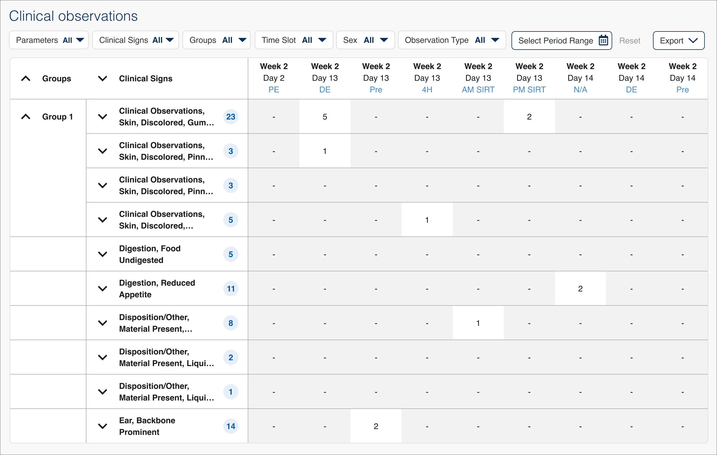
The interface forced them to do this manually, scrolling through dense tables and relying on visual scanning to find what mattered.
A typical study could include:
- 14,000+ data points
- multiple subject groups
- repeated measurements over time
Users had to scroll through rows and columns looking for out-of-range values, making the process slow, repetitive, and error-prone. This greatly limited how quickly insights could be found and acted on.
Exploration: Finding a better way to surface anomalies
Based on research, the goal wasn’t to display more data but to make anomalies immediately visible.
I explored several approaches to surface patterns without requiring users to scan entire datasets. Early concepts explored different ways to highlight trends and outliers, including variations of aggregated views and simplified visual summaries.
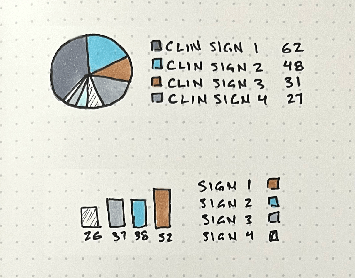
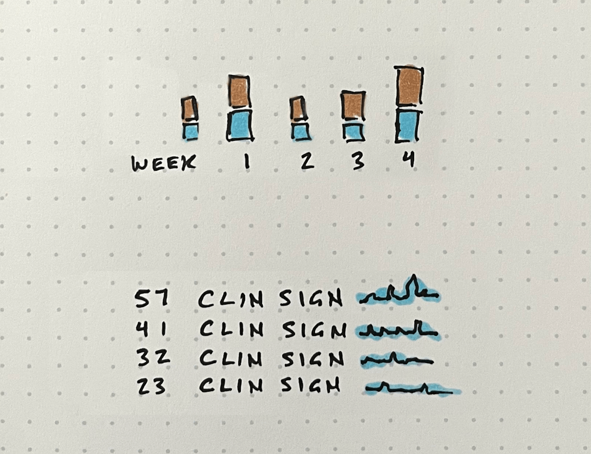
One promising direction was using sparklines to embed trends directly alongside data, allowing users to quickly scan for spikes without leaving the table. I built a prototype of this using AI coding tools to test the concept, the interactive prototype is embedded below. While this approach improved scanability, it still required users to interpret patterns across many individual rows and wasn't easily scalable.
To make anomalies more immediately visible, I shifted toward higher-level visualizations that surfaced patterns across entire datasets. This led to a set of visualizations that made trends and anomalies visible at a glance.
Solution: Making anomalies immediately visible
I replaced dense data tables with visualizations that surfaced trends and outliers at a glance, allowing users to quickly identify areas of interest and drill into specific data for deeper analysis.
Before
After
Exploring the data in practice
Results: Faster anomaly detection and clearer insights
The redesigned experience made it dramatically faster and easier to identify anomalies in complex datasets.
- Reduced anomaly detection time by approximately 90%, decreasing initial analysis from 20–30 minutes to 2–3 minutes
- Enabled faster identification of critical study issues
- Reduced reliance on manual data scanning
- Contributed to operational efficiencies estimated in the millions annually
What previously required careful, time-intensive review became something users could understand at a glance.