Rev Max | SaaS Subscription, Growth
Increasing Rev Max subscriptions 40% in 6 months
+40% subscribers • ~$1M ARR • Clearer pricing & usage
Overview: Turning Rev Max into a clear, premium experience
Rev Max was a subscription-based platform for audio and video transcription that offered a new purchase option to the by-the-minute model that Rev had traditionally employed. However, after launching the MVP customers struggled to understand the recurring value, monitor their usage, and confidently manage their plans.
I led the redesign of the subscription experience, improving clarity around pricing, usage, and account management as well as reducing friction across key workflows. These changes contributed to a 40% increase in subscribers over six months, helping the product reach ~$1M ARR.
Context: From pay-per-use to a subscription model
Rev traditionally charged per transcription minute, charging lower rates for AI transcription (about 90% accurate and ready in minutes) or more for human transcription. Rev Max introduced a subscription model, bundling AI transcription minutes with optional paid add-ons. The product launched as an MVP but needed refinement to support broader adoption.
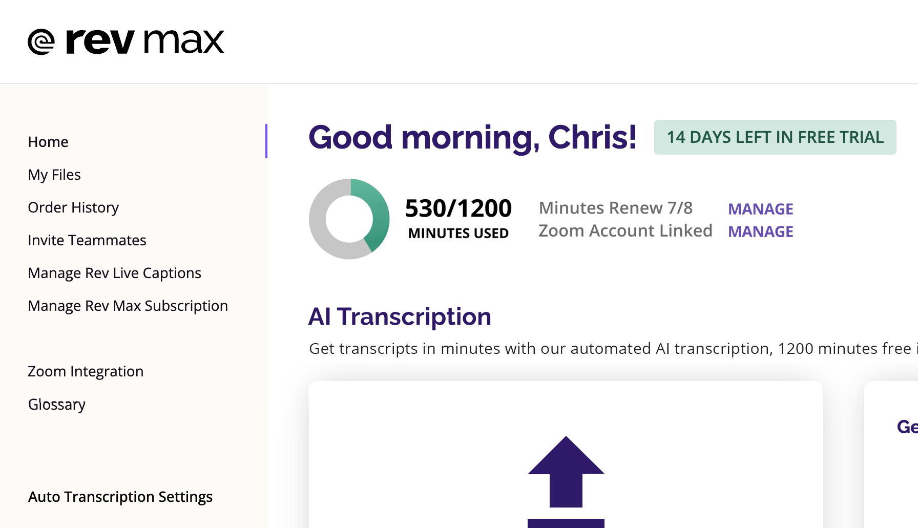
The MVP struggled visually and the color palette didn’t help, there was a general “purple on purple” problem (jokes about Barney and Grimace were frequent). It had also been built utilizing a design system developed for Rev’s marketing site, and the bright brand colors and chunky type unfortunately made the product feel less refined than the premium experience that leadership wanted.
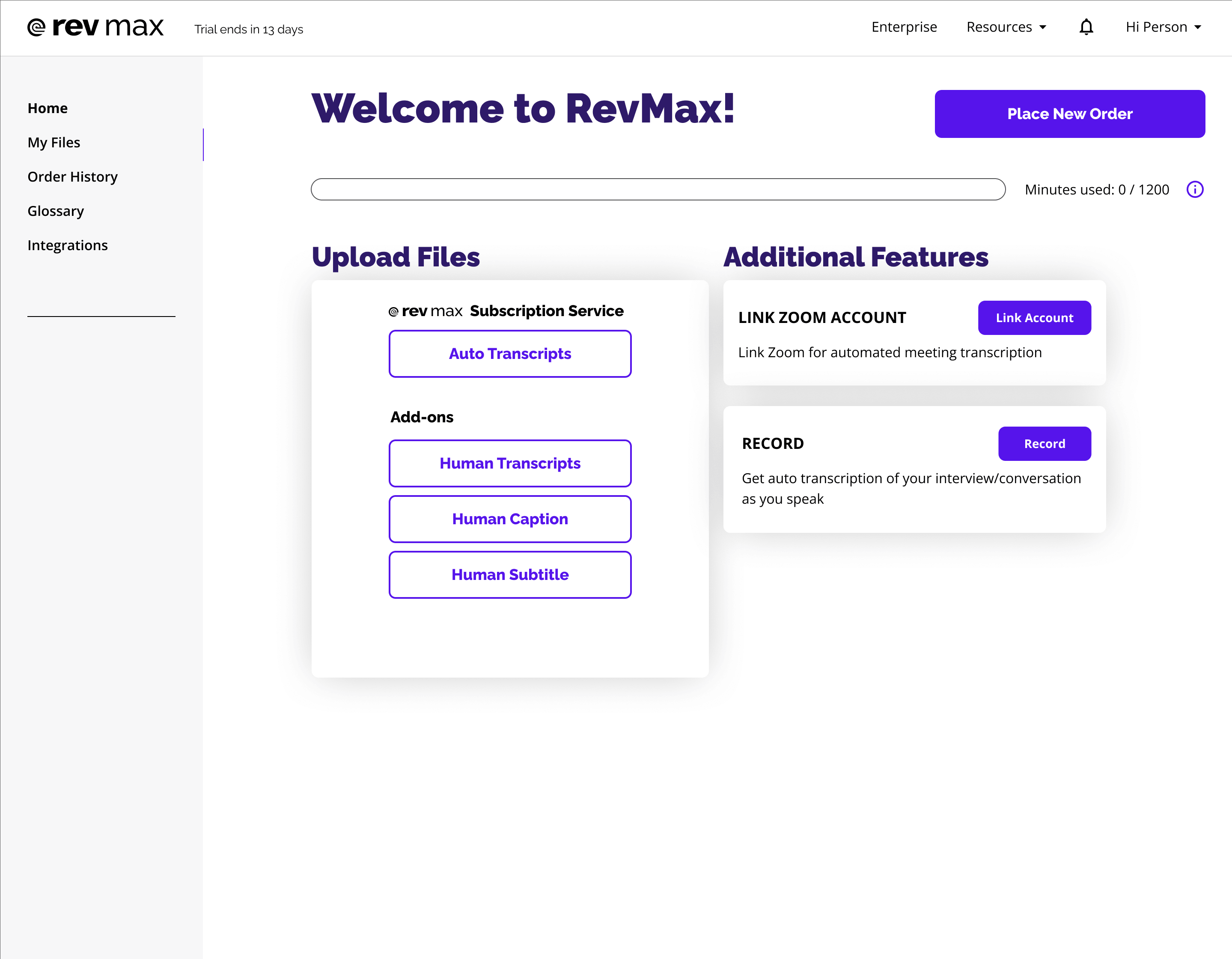
Problem: Customers struggled to understand and trust the subscription model
Rev Max represented a shift from transactional purchases to a recurring subscription model, but customers struggled to understand what they were paying for and how much value they were receiving. To understand why, I conducted interviews with power users, people who relied on Rev Max daily or used a larger volume of minutes than most users.
Conversations ranged from surprising (a court reporter running four separate accounts to cover her workload) to insightful (getting to hear the behind the scenes with journalists whose work I regularly read) to occasionally chaotic (freelancers have some fun stories).
There was also a steady stream of issues surfaced from our customer support team via Slack, and the concerns were consistent across all sources:
- Users didn’t understand what was included vs paid add-ons
- They couldn’t easily track remaining transcription minutes
- Managing their subscription required too much effort and the settings were hard to find
The problem wasn’t a lack of features, it was a lack of clarity and trust in the product. Users couldn’t easily answer, “What am I paying for, and how much value am I getting?”
Approach: Building trust in the subscription model
Research revealed that customers weren't evaluating plans based on features alone. They wanted confidence that they understood their current usage, future costs, and overall subscription status.
This shifted the focus from explaining subscription features to making usage, account status, and value immediately understandable.
This meant:
- Making pricing and feature boundaries explicit
- Surfacing usage and account state prominently
- Elevating the UI to feel like a premium product
Defining a more engaging and premium product experience
The live recording and transcription experience was one of the first places users interacted with the product and was a fun introduction to Rev's technology. Unfortunately, in the MVP it felt pretty underwhelming.
I used the rework of live recording as an opportunity to define the visual direction for Rev Max, exploring motion and a card-based interface that made the live AI transcription feel more dynamic and engaging.
This evolved a bit after initial launch as I adapted the design system to better fit Rev's digital products, but it became a foundational pattern for the rest of the product. The updates helped shift the experience from simply functional to a product that felt polished and premium.
Solution: Clarifying the product and reducing friction
Usage & Account Clarity
Making subscription status instantly understandable
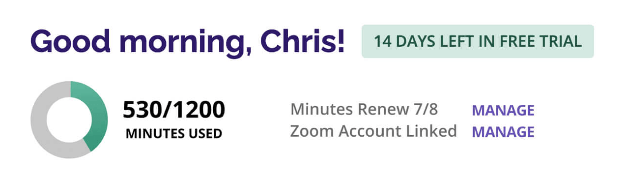
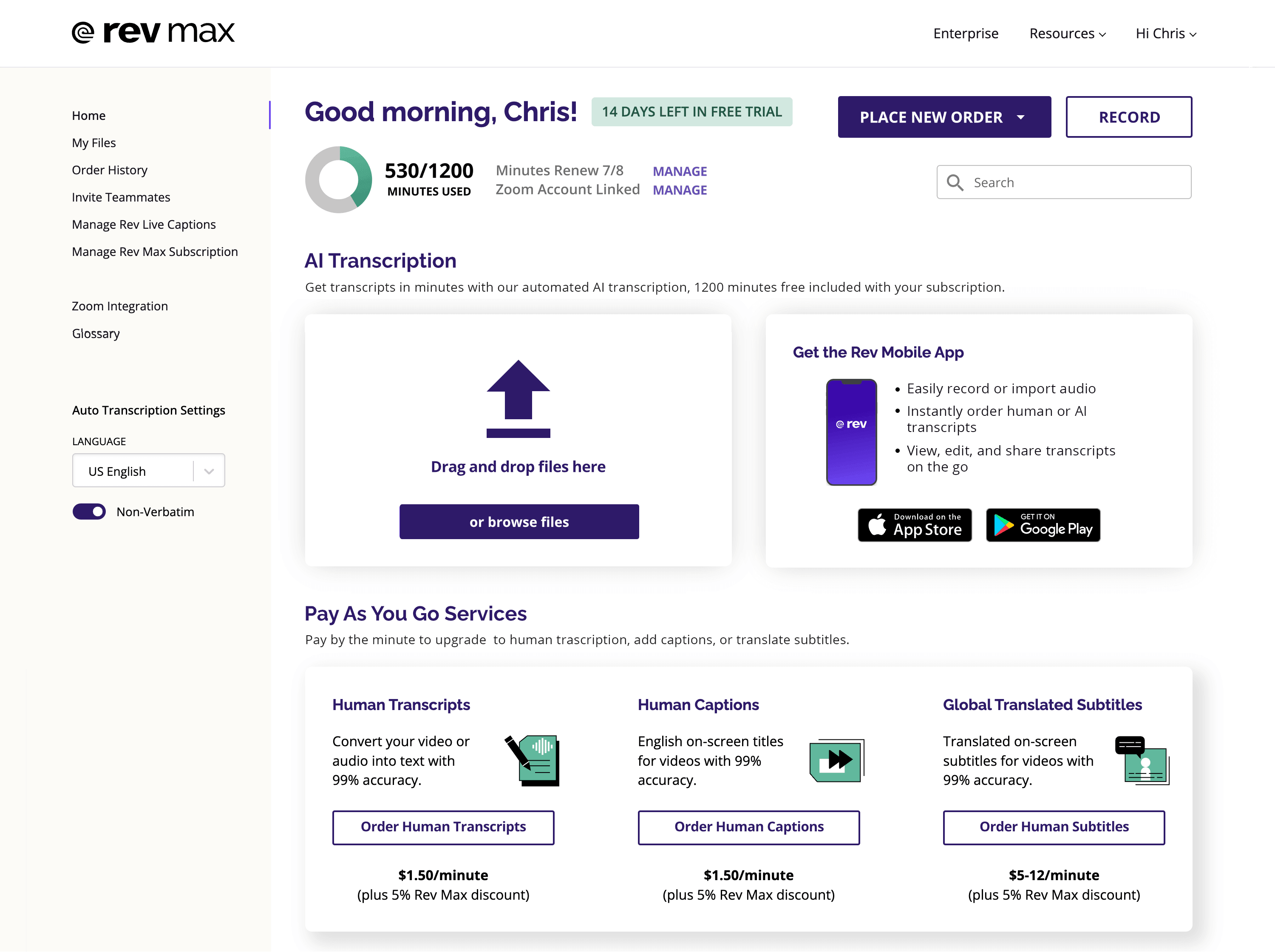
I introduced “the donut”, a compact, easy to read usage meter that made remaining transcription minutes immediately visible. Combining that with other key account info like a renewal status tag and easy access to other settings addressed the status and updating issues we’d heard from users.
Pricing Clarity
Helping users understand what they’re paying for
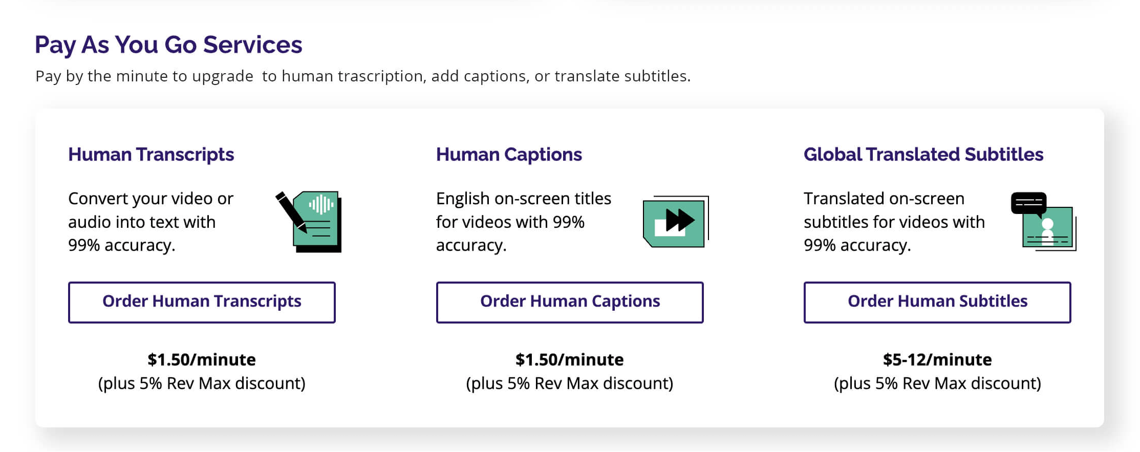
Clearly separated included subscription features from pay-as-you-go services, making it easier for users to understand what they were paying for.
Workflow Improvements
Reducing friction in core actions
Reduced friction across key workflows by simplifying navigation and improving access to files and core actions.
Product Experience
Creating a more cohesive, premium feel
Refined the visual system to create a more cohesive, premium experience aligned with user expectations.
Mobile Experience Upgrade: Real-time transcription
Mobile usage was one of the strongest retention signals we saw, particularly among journalists and interviewers.
One frequent request was to add a live transcript view during recording, something that would be particularly useful in crowded press conferences where it could be a challenge to easily hear the speaker. Being able to track that transcript in real time would be an asset for reporters who constantly dealt with tight timelines, enabling them to quickly note and forward details about a quote to a broadcast team before a press conference had even ended.
I led design for this feature so that users could follow the transcript in real time, and also pushed for it to be moved up in the backlog so it could be developed and added to the app sooner.
After the update launched, a producer from ESPN told us he had switched from our competitor specifically because of this capability. I like to think that there’s clips that wouldn’t have made the 6pm SportsCenter if the feature hadn’t been added.
Results: Increased growth and stronger product trust
By reducing friction and improving pricing and account clarity, the product became easier to understand, trust, and adopt.
- Increased subscribers by 40% over six months
- Helped grow the product to ~$1M ARR
- Reduced confusion around pricing and usage
- Improved trust and perceived product quality
While increased marketing contributed to growth, improving clarity and reducing friction in the product experience played a key role in conversion and retention.
By making the product easier to understand and easier to use, Rev Max shifted from an experimental MVP to a product users relied on regularly, driving stronger adoption and long-term subscription growth.